
September SketchBox: You Said “Paint Your Office”… So I Painted the Beach
September 2026 ~ SketchBox Mixed Media

 eptember’s SketchBox School project was called Paint Your Office.
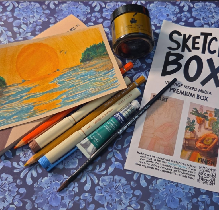
The box gave me a beautiful vintage-inspired collection of browns, blues, greens, orange and gold, along with watercolor pencils, fine liners, Daniel Smith Walnut Ink and other mixed-media supplies.
I looked at the warm golden colors.
I looked at the blues and greens.
I looked at the lovely vintage office in the lesson.
And naturally, I painted a beach.
Apparently, if you give me enough ocean-adjacent colors, eventually we’re going to end up somewhere near the water.
September SketchBox: Paint Your Office... So I Painted the Beach
The original SketchBox School project used September’s vintage mixed-media palette to create a warm interior scene. I loved the palette and the opportunity to experiment with all of the different materials, but rather than recreate the room, I wanted to see where those same supplies would take me.
Apparently they took me directly to the coast.
The enormous orange sun came first, and everything else grew outward from there.
What I especially enjoyed about this experiment was combining watercolor pencils, Walnut Ink, watercolor and fine liners without asking any one medium to do all of the work.
The pencils supplied texture and color. Water transformed portions of them into washes. The Walnut Ink created warm, earthy landforms and shadows. Viridian brought the shoreline to life, and the fine liners gave me a way to finish everything with loose, energetic marks.
The finished piece still carries the brown, blue, green and gold character of September’s vintage palette.
It just escaped the office.
Painting My September Beach
I began with a simple line to establish the horizon.
Then, using the orange watercolor pencil, I drew a large circle for the setting sun and began filling it with color.
I brought in the gold watercolor pencil to deepen the sun and used both orange and gold beneath it to establish the reflection stretching across the water.
Rather than completely filling the ocean with color, I lightly grazed the watercolor pencils across the paper. I wanted broken marks and untouched areas of the page because those irregularities would eventually help create the movement and reflected light of the water.
Turning the Pencil Into Paint
Once I had the dry color where I wanted it, I added water to my paintbrush and worked directly over portions of the watercolor pencil.
The pencil softened into watercolor right on the page.
I deliberately didn’t activate every mark. I wanted some of the original dry-pencil texture to remain beside the softer painted areas rather than blending everything into one perfectly smooth wash.
That mixture of drawing and painting became part of the texture of the finished piece.
Building the Mountains and Shoreline
Next came the Daniel Smith Walnut Ink.
I used the Walnut Ink to establish the mountains and beaches along the sides of the scene. Its warm brown worked beautifully against the orange and gold without competing with the enormous sun.
For the darker vegetation beneath the trees, I alternated between Viridian Hue and Walnut Ink.
Rather than creating a solid block of green, I allowed the two colors to mingle visually and form an irregular forest-floor texture.
Then I used fairly concentrated Viridian Hue and the tip of my brush to paint in the trees.
Happy little trees, obviously.
Giving the Sky More Sky
At this point, I liked the sun, but the surrounding area simply didn’t feel sky enough.
Instead of smoothing everything out, I decided it needed more texture.
I used the orange watercolor pencil to run broken circular marks outward from the sun. Then I shaded between portions of those marks with the gold pencil.
This time I left the pencil dry.
Keeping those marks visible helped separate the enormous glowing sun from the surrounding sky while still tying everything together with the same orange-and-gold palette.
Making the Ocean Move
For the water, I picked up the blue fine liner.
Instead of carefully drawing individual waves, I swished light, broken strokes through the water, allowing the marks to move through the blue, orange and gold areas already on the page.
Those quick strokes created the choppy movement I wanted without covering the reflected color underneath.
I used the brown fine liner to add additional detail to the beaches and mountains.
Then, because no enormous sunset is complete without them, I gave the sky a couple of tiny distant birds with the brown liner.
Finally, I returned to the sun’s reflection and worked a little more gold back into the water.
And that was it.
My office was officially a beach.
My September SketchBox Process
If you’d like to use my painting as inspiration for your own experiment, this was my basic process:
- Establish the horizon and draw the sun with orange watercolor pencil.
- Deepen the sun with gold and use orange and gold to establish its reflection.
- Lightly graze watercolor pencil across the water, leaving broken areas of paper visible.
- Activate selected pencil marks with a wet brush while leaving some of the dry texture intact.
- Use Walnut Ink to establish the beaches and distant mountains.
- Alternate Walnut Ink and Viridian Hue to create irregular vegetation and forest texture.
- Use concentrated Viridian and the tip of the brush to paint loose trees along the shoreline.
- Add broken circular marks around the sun with orange pencil and shade portions with gold, leaving this layer dry.
- Use a blue fine liner in quick, light strokes to create choppy movement across the water.
- Add detail to the beaches and mountains with the brown fine liner.
- Finish with a couple of distant birds and additional gold in the sun’s reflection.
The important part isn’t making my beach exactly as I made it.
For me, projects like this are an opportunity to discover what unfamiliar materials can do and then ask:
What else can I make them do?
The original lesson gave me a collection of materials, a limited vintage palette and an opportunity to experiment with layering, line, watercolor, ink and texture.
I simply allowed the subject itself to wander somewhere else.
Sometimes following an art lesson means recreating the example.
Sometimes it means learning the technique and then cheerfully wandering off the path to see what happens.
And sometimes SketchBox tells you to Paint Your Office and your imagination packs a bag and heads directly for the coast.

This Adventure Was Made Possible By
SketchBox
Discover monthly collections of thoughtfully selected art supplies, creative projects, and lessons designed to encourage experimentation and artistic growth.
Thank you @getSketchBox for another wonderful month of creative inspiration.
*This is an affiliate link. I may receive a benefit if you subscribe through it, at no additional cost to you. Please see my Affiliate Disclaimer for details.
Find Me Around the Grotto
Follow along for art, sewing, reading, and quiet adventures.